Wild Card Website case study
Student savings, brought to life
A bold website for Wild Card, giving students a place to discover current offers, understand the membership and find their way into the app.

The brief
Turn the membership proposition into a clear, visual website: show what students can discover, explain how it works and make the app easy to find.
- Client
- Wild Card
- Year
- 2026
- What we did
- Website design & buildLive offer integrationMembership journeyMobile responsive design


The challenge
- Explain the membership at a glance
- Keep the offers connected to the live platform
- Carry the app’s identity onto the web
Our solution
- A bold red-and-black design built around the Wild Card brand
- An offer feed with category browsing
- A dedicated membership page with clear app download links


The mobile experience
Every detail, on every screen.
Swipe to explore


Other projects
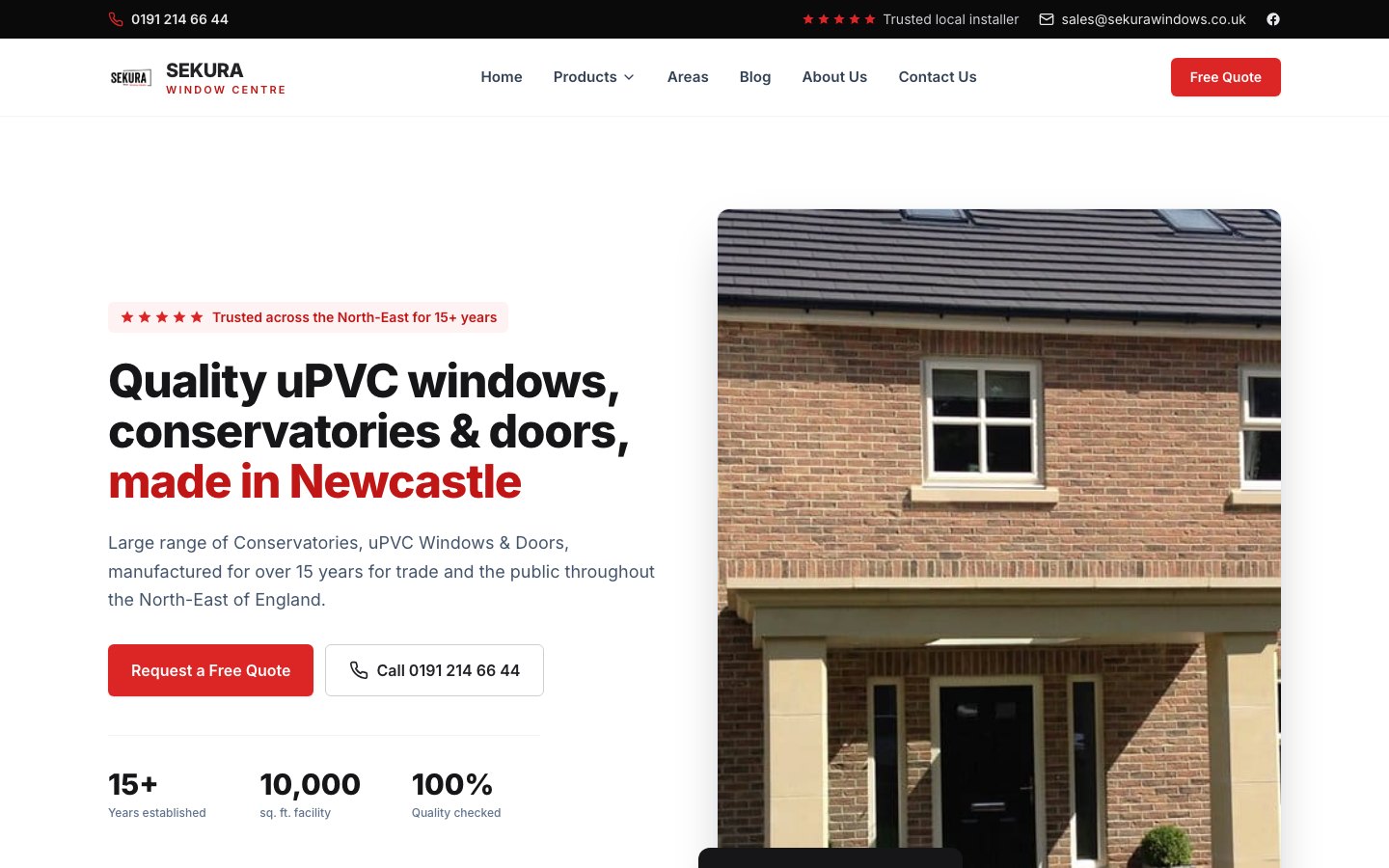
Sekura Windows
An established window company, online at last
A new website for Sekura Window Centre, a North East windows, doors and conservatories company. Built in their own black and red, around the call or the free quote, with a page for each town they cover.
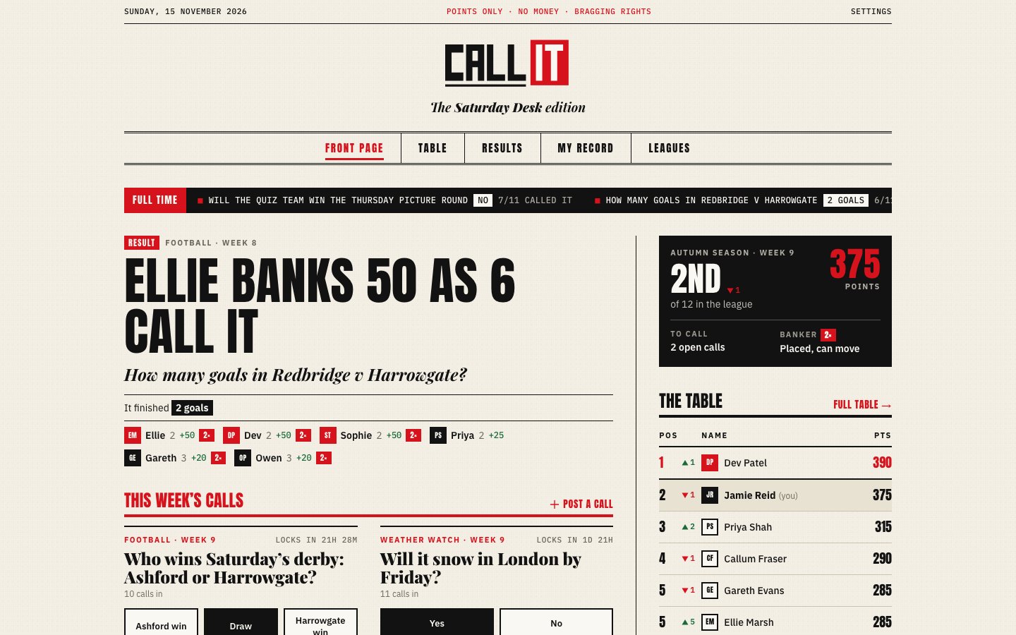
Call It
Settle the group-chat argument
Call It is a predictions game for friends, played for points and bragging rights: post the week’s big questions, make your call before it locks, and let the league table settle who saw it coming.
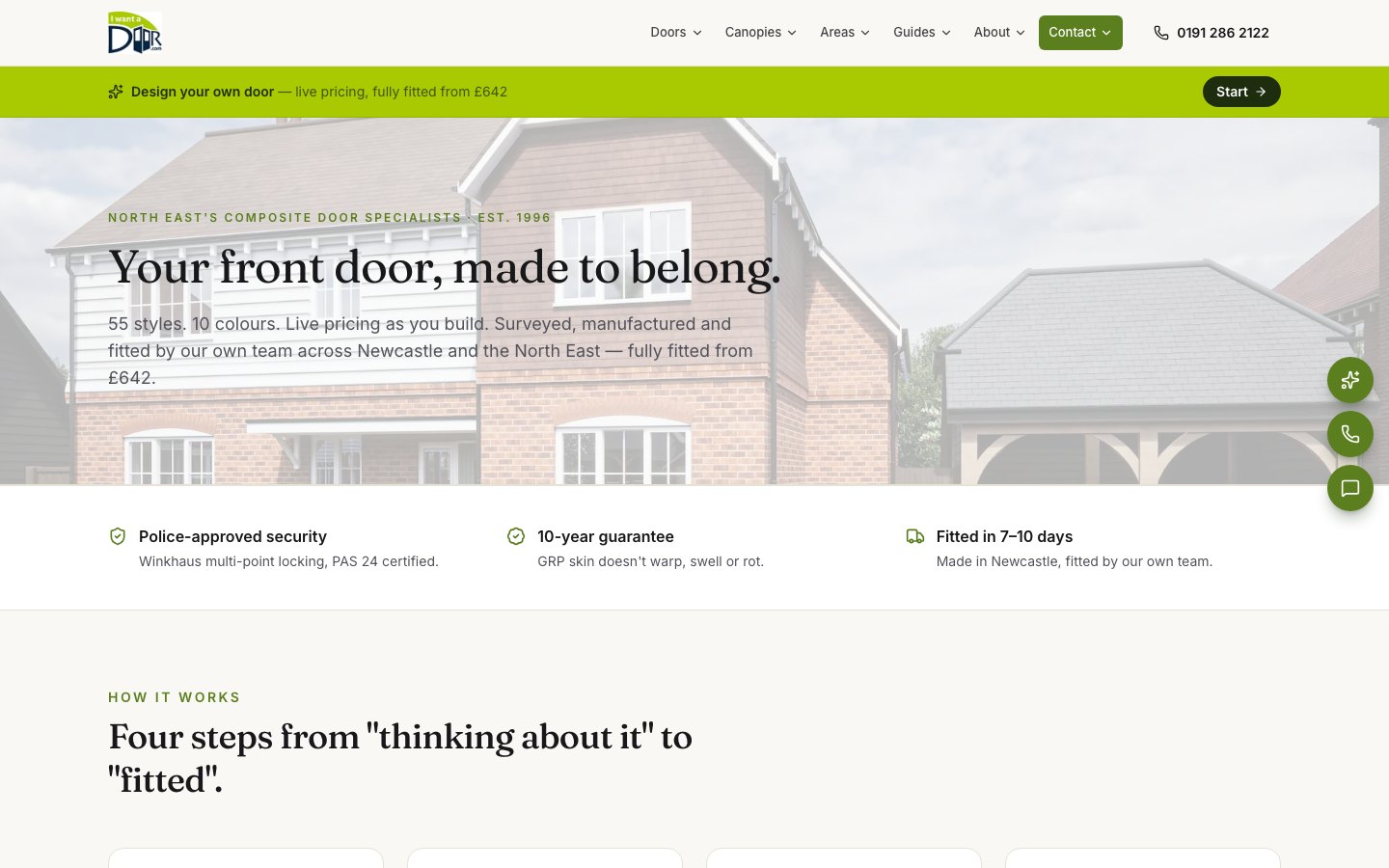
I Want A Door
Design your front door, then get the price
A new website for I Want A Door, built around a step-by-step door builder. Customers choose the style, colour, glass and handle, see the door and its price as they go, and send it as a quote request straight into the team’s own admin.
Want a website like this?
Tell us about your business and we'll come back within one working day with how we'd approach it.